What actually deserves to be in your line of sight all day?
B Smart Glasses.
I designed the companion app for India's first smart glasses by Lenskart. The hardest part was not the features, it was helping people use something they had never seen before.
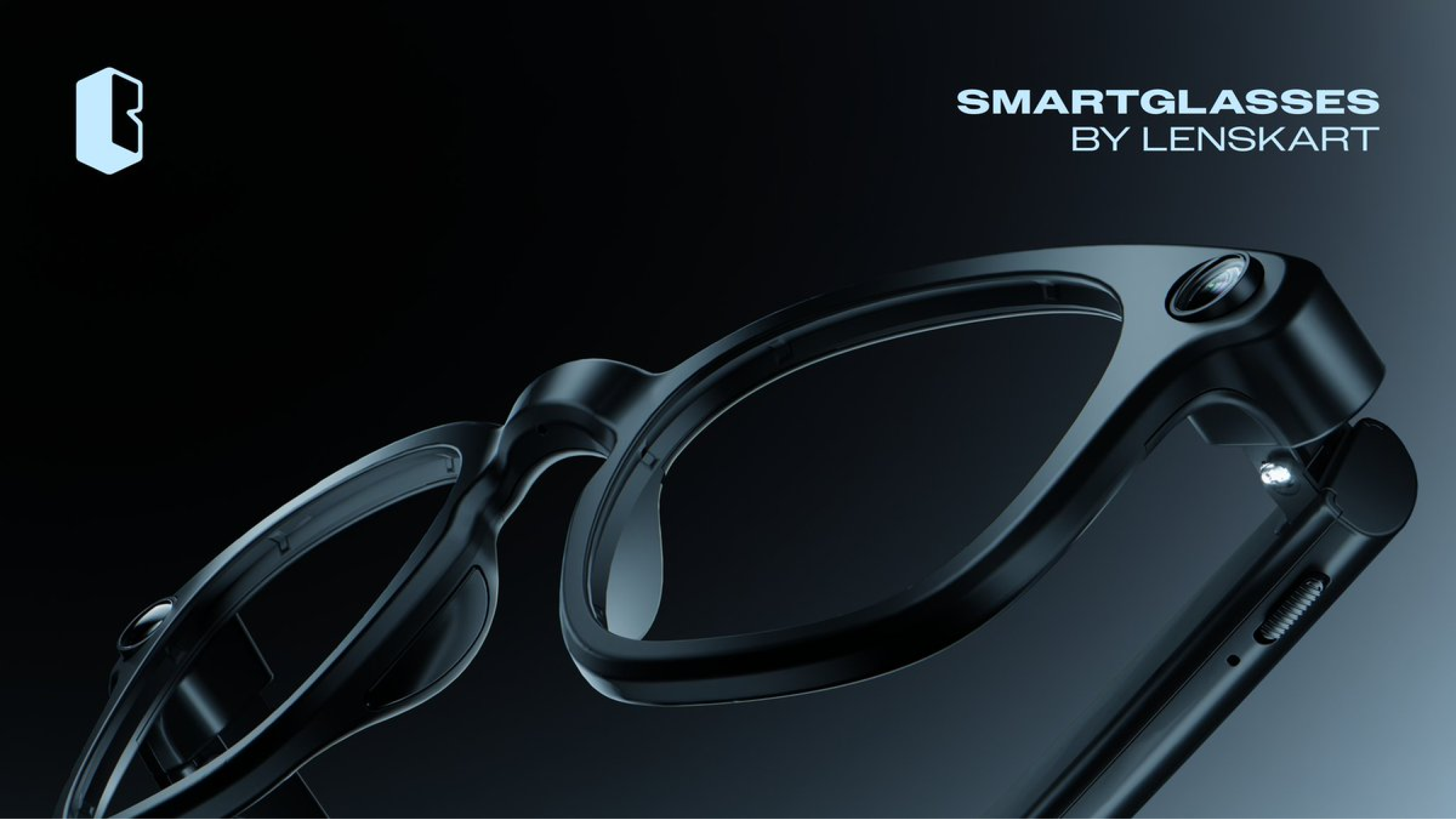
I didn't just design screens. I owned the experience.
- 01Led design from start to finish, for the companion app for smart glasses.
- 02Made it easy for people who have never tried smart glasses before.
- 03Owned the first-time setup, Buddy (the voice assistant), and every main flow inside the app.
Ray-Ban Meta was already out there. People had expectations.
We weren't inventing a brand new thing. But we were building it for an Indian market that had never worn a tiny computer on their face. The hard question was: how do you teach someone a product they have no mental picture for?
Four parts of the experience.
Pairing, gallery, voice, settings, the app does it all. The real question was never "what features", it was "how do we keep it from feeling like too much?"
Capture, view, return
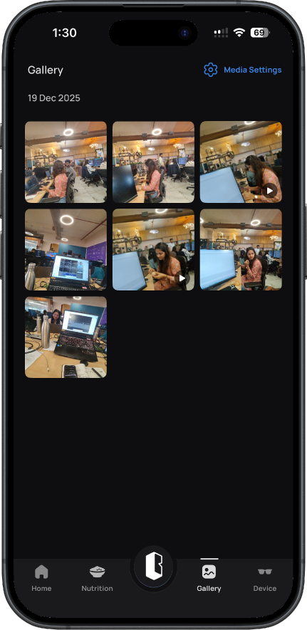
Photos and videos in one place. No menus to dig through. The thing you use daily should be one tap away.
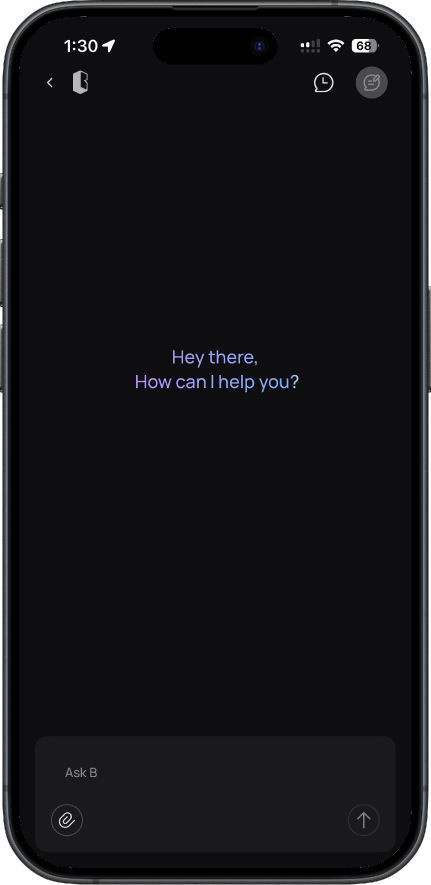
A voice that feels human
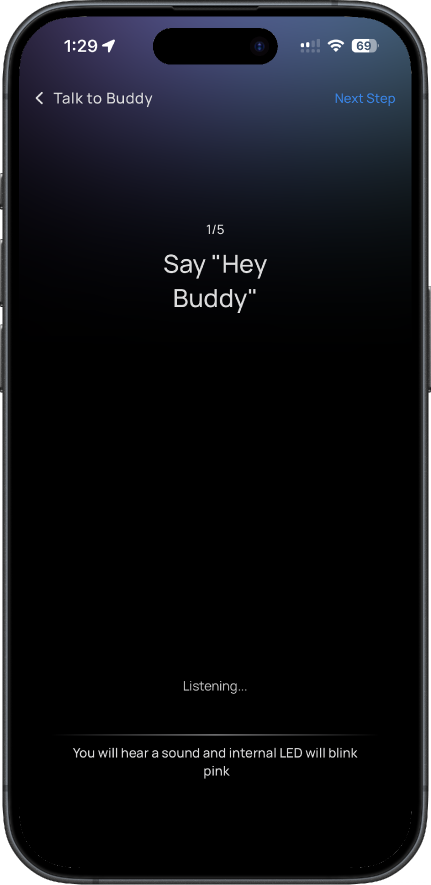
When to listen. How to reply. How much to say. Even "Say Hey Buddy" had to feel easy, not awkward.
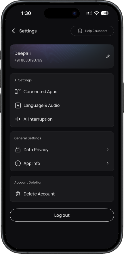
Settings without overwhelm
Controls for the glasses. The hard part was not adding features, it was making sure nothing felt heavy.
Learn by doing
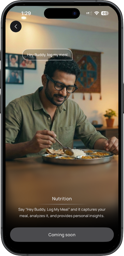
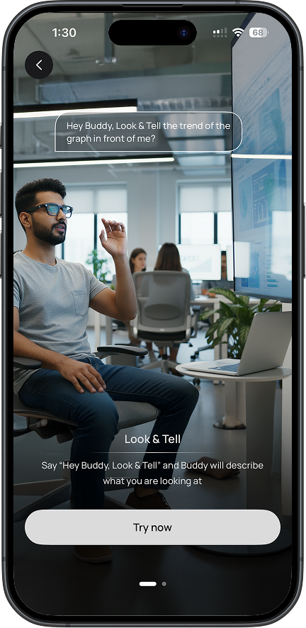
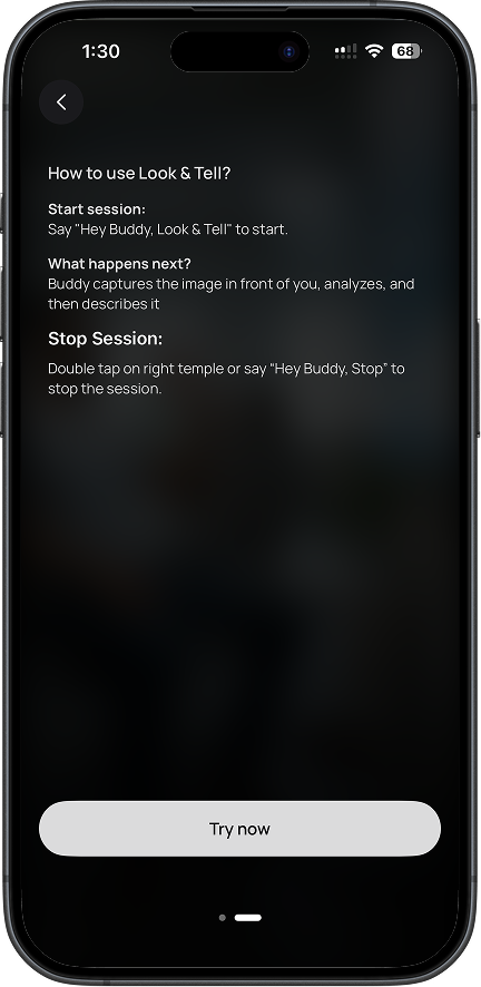
Instead of long explainers up front, we showed people how to use it while they used it. Less confusion, more confidence.
What it actually looks like.
Calm, dark, easy to read in any light. Built for everyday use.
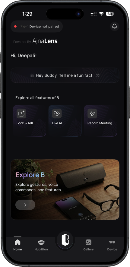
The product was good. The category was new.
People felt lost, not because the product was broken, but because nothing in their day looked like this. So confusion was the starting point. We had to design our way out of it.
People were confused, not because the product was bad, but because this kind of thing is new.
↳ Smart glasses are not phones. There is no habit you can lean on.
Ray-Ban Meta users picked it up fast. Most people don't come with that head start.
↳ We couldn't design for the 5% who get it. We had to design for the 95% who don't.
Some buyers came in out of pure curiosity, with no idea what to expect.
↳ Curiosity is fragile. One bad moment kills it. Setup had to feel safe.
Help them while they use it. Not before. Not after.
We swapped long explanations for live tutorials. People learned by doing, with small hints right where they needed them. Confusion dropped, comfort grew.
We ran user tests again and again. Things that looked great in Figma but failed in real life got cut. The work was not adding, it was removing.
Lessons from designing at the edge of new.
"Being clear matters more than being clever."
When something is brand new, the first job isn't to impress. It's to help people find their feet.
"If people don't get it in the first few minutes, they won't stay long enough to see the good part."
Every second of confusion is a person you've lost. The product can be amazing, but if setup fails, no one finds out.
"A lot of things looked nice but didn't help. Those had to go."
Letting go of work you like is part of the job. Real users don't care about your Figma file.