Ajna Design System
A shared foundation for the next screen.
Ajna’s internal tools were growing, but familiar interface elements were being recreated across products. Buttons, forms, and layouts became inconsistent, while handoffs required repeated clarification.
I worked on a design system that brought shared foundations, reusable components, documentation, and theme support into that workflow.
My role
Build a structure that could support shared work
I structured components using variants and variables, applied Figma variable modes for dark mode, and used auto layout to support responsive behaviour.
I also documented usage, worked with developers on feasibility, and explored edge cases through real use and feedback.
The problem
Repeated design work was creating inconsistency and slowing handoffs
Across the internal tools, teams were rebuilding similar buttons, forms, and layouts. Those separate decisions introduced inconsistent visual patterns and repeated work.
Developers needed clearer specifications to reduce back-and-forth. Designers needed ready-made templates and variants they could trust instead of starting again for common requirements.
The challenge was to create a shared foundation that made recurring decisions reusable and clearer to implement across products.
Team needs
What the system had to support
The project identified three recurring needs: consistent visual patterns across tools, clearer specifications for developers, and reusable templates and variants for designers.
Pain points
Where repeated work created friction
- Similar buttons, forms, and layouts were being rebuilt across products.
- Separate decisions introduced inconsistent visual patterns.
- Unclear specifications created back-and-forth during handoff.
Approach
Build a shared foundation teams could use
I organised visual decisions into tokens and structured components with variants, variables, and auto layout. Documentation and developer collaboration supported their use and implementation.
The scope prioritised depth and quality in common components, worked with existing patterns where possible, and focused on 2D interfaces. Real use and feedback helped surface edge cases.
The system, visual by visual
Foundations and specification sheet
Give recurring decisions a shared definition
Problem
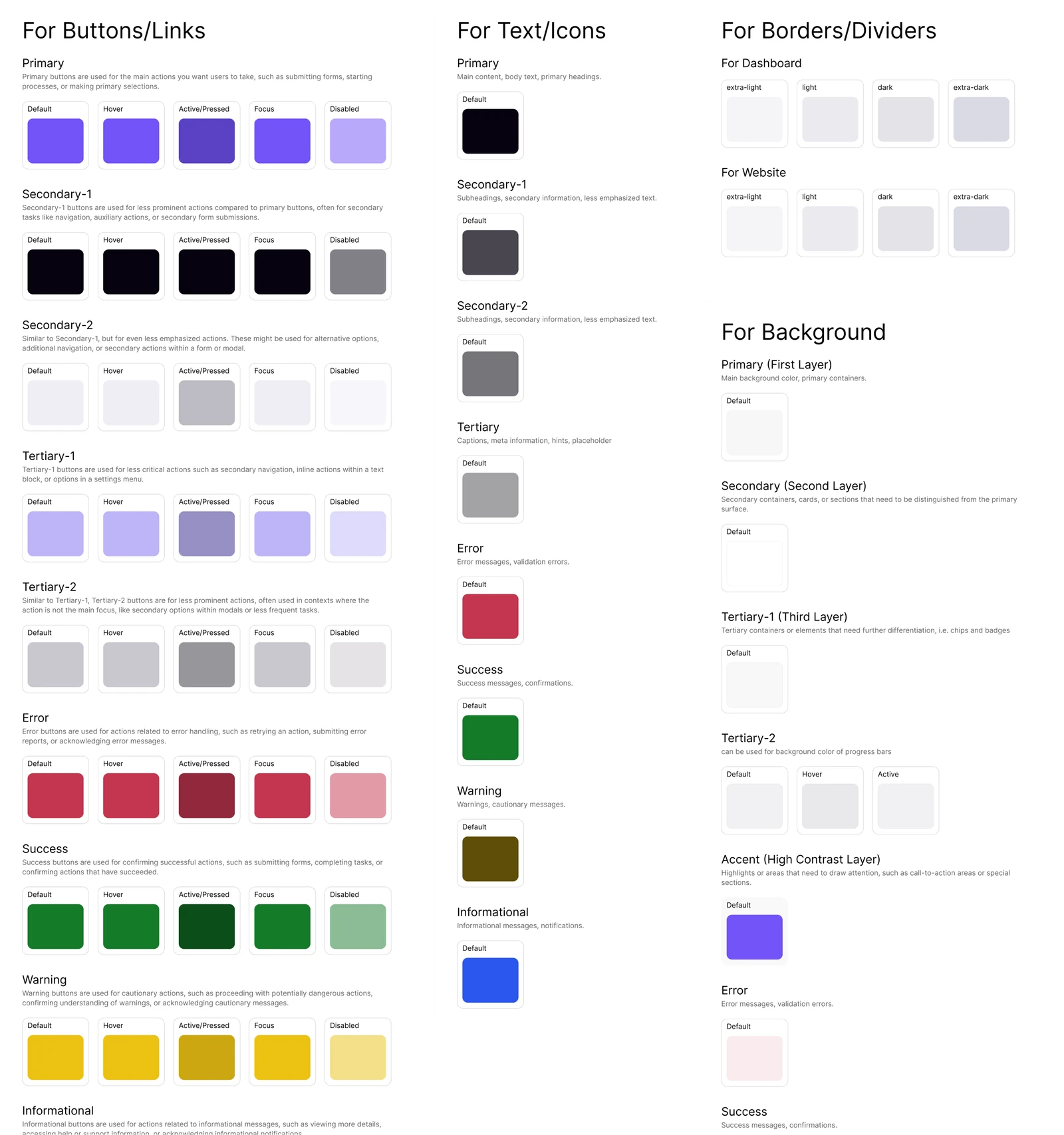
Internal tools had inconsistent visual patterns, and teams were repeatedly choosing values for similar elements. Developers also needed clearer specifications.
Design response
Colour, typography, spacing, and borders were organised into tokens to provide a shared reference.
Text and icon colours reflected content hierarchy and feedback states. Backgrounds used named layers, while borders had defined levels of emphasis. These roles helped organise the interface consistently and formed part of the structure for theme changes.
The specification sheet brought these definitions together with component states. Usage documentation addressed developers’ need for clearer specifications, while collaboration with developers helped ensure the design was feasible to implement.
The reason for documenting the system alongside its components was to make recurring decisions understandable and reduce repeated clarification during handoff.
Responsive typography and spacing
Keep foundations consistent across screen sizes
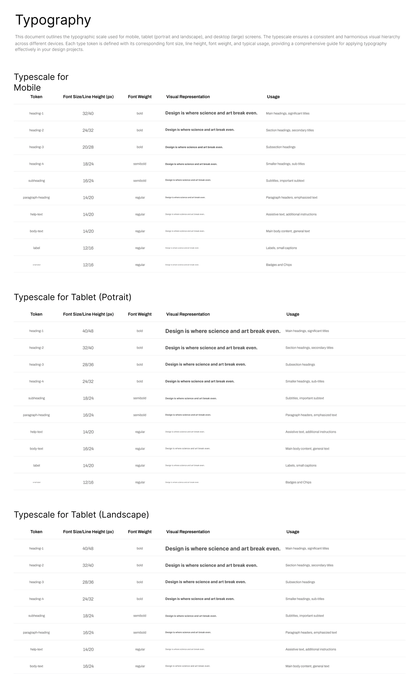
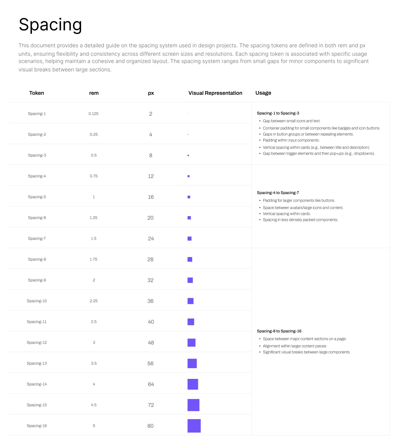
The system defined typography for mobile, tablet portrait, tablet landscape, and large desktop screens. Shared spacing values covered component-level gaps through to larger sections.
Auto layout and variables supported responsive behaviour. These foundations gave teams a consistent reference as layouts adapted across contexts, instead of defining new values for each screen.
Components and patterns
Make common requirements reusable
Problem
Designers were rebuilding similar components and needed reusable templates and variants. Developers needed the different states of a component to be specified clearly.
Design response
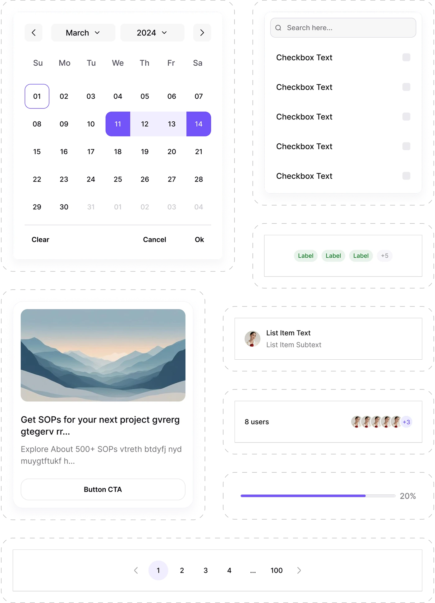
I structured components with variants and states such as default, hover, active, focus, and disabled. This brought recurring requirements into reusable components and made their different appearances explicit.
Defined override behaviour allowed designers to customise layered components while preserving their underlying structure. The aim was to give teams flexibility within the consistency the system was created to provide.
The library supported date pickers, search with checkbox lists, label groups, list items, avatar stacks, progress bars, pagination, and cards. These patterns used the same colour, spacing, and typography foundations.
Light and dark modes
Use one component structure across themes
Design challenge
Support dark mode without maintaining a separate file or duplicated component set.
Design response
Figma variable modes allowed the same components to switch between themes. A mode change applied the corresponding values through the shared structure, supporting a one-click theme change in Figma.
Outcome
Less repeated work and clearer shared decisions
The project reported a 40% improvement in design workflow speed for common flows.
Clearer specifications reduced developer questions. Variable modes supported a one-click theme change in Figma, and the system became a starting point for new internal products.
The most meaningful part was seeing other designers use the foundation to move faster with less friction.
What I would do differently
Bring developer feedback in earlier
I would involve developers earlier in the foundations of the system.
Working on Ajna showed me how decisions about token naming and variable structure can affect teams later. Earlier feedback would help align those decisions with how engineers need to use them.
What I learned
Structure shapes work beyond the original file
A small naming or component decision can influence many screens and later conversations.
The system helped me see variables and reusable components as a way of organising decisions for other people. Its value became visible when those people could build on the structure with less friction.