Mai Smartband
Making room for her own wellbeing.
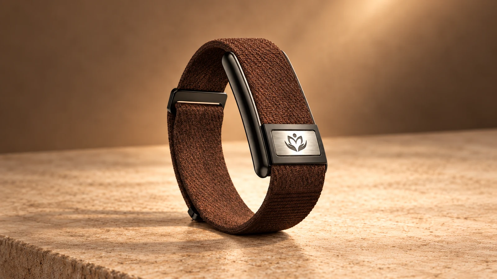
Mai is a smartband and companion app designed to help women make time for their health within their daily routines.
The project began with a brief to create a health app women would use regularly. Conversations in rural Madhya Pradesh helped us understand what could make that difficult, and shaped an experience built around small activities, understandable information, and visible progress.
Selected work is shared here. Detailed research and parts of the product remain confidential.
My role
I collaborated on research to understand women’s daily routines, health concerns, and the challenges they faced in making time for themselves. Working with another designer, I helped translate these insights into the app’s UX flows and UI, making onboarding, health information, and daily activities clear and approachable.
The problem
Make daily health care fit into women’s lives
The brief was to create a women’s health app that people would use regularly. Our early assumption was that clearer information would help.
Research showed that family, work, and established routines also affected whether women could make time for their health. The challenge was to create an experience they could fit into their day, across different language and literacy needs.
The research
Listening changed our understanding of the problem
We spoke with 100 women in rural Madhya Pradesh, aged 16 to 50, in their homes and villages.
The conversations explored their routines, health concerns, and everyday habits. Women described putting family and work ahead of their own needs, including irregular meals and limited time for self-care.
These observations shifted our focus towards behaviour. Making information available would not, on its own, make space for a new routine.
Pain points
What stood in the way of daily care
- Family and work often took priority over personal health, including regular meals and time for self-care.
- Health terminology needed to be understandable to women unfamiliar with it.
- Different language and literacy needs had to be considered in the setup and daily experience.
Design hypotheses
Make participation manageable
Small daily activities could fit more easily into existing routines. Simple health summaries could make the information easier to understand. A progress tree could let users return after a gap without losing the visible record of their earlier effort.
These ideas shaped the screens below. Later user feedback is included with the relevant screen.
The experience, screen by screen
Onboarding and profile
Make the plan relevant to the person
Design need
The plan needed to reflect the individual’s health information, while the setup needed to accommodate the language and literacy needs identified in the project.
Design response
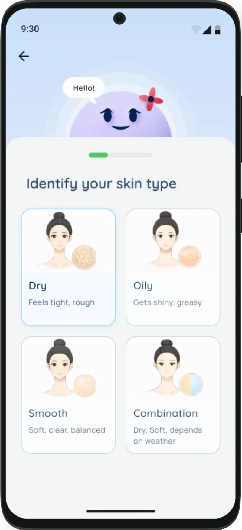
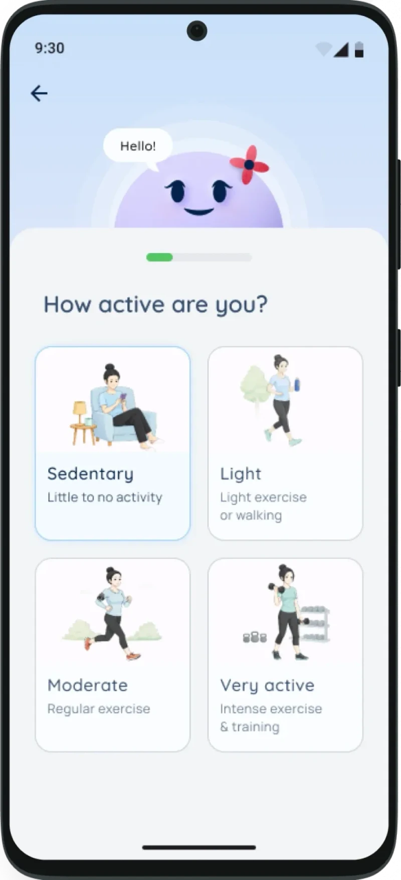
The product collected information about the user, including symptoms and blood reports, to inform a personalised plan. Profile brought personal information into the experience, while the onboarding screens asked about the user and their routine.
The reason was to shape the plan around the individual’s health information. Visual prompts, simple wording, and language support addressed the literacy and language needs identified in the project, reducing reliance on long written instructions.
Problem found during testing
Some older users found onboarding too long: there were too many steps before they reached the main app. Users appreciated the personalisation, but setup length remained an issue.
Although individual screens were simple, the whole setup still asked too much before users could begin.
What I would change
I would ask only for the information needed at the beginning and move the remaining questions later. This directly responds to the feedback about setup length.
Plan and today
Make daily effort visible and manageable
Problem from the research
Family, work, and established routines could take priority over self-care. Finding room for daily health activities was part of the challenge.
Design response
The plan used small daily activities intended to fit into the day.
A growing tree visualised participation. Completing tasks added leaves. After a missed day, a leaf could turn brown, but the whole tree remained and could grow again when the user returned.
We chose this approach over a streak counter because we wanted progress to feel ongoing. Missing a day should not erase all previous effort. The decision reflected the responsibilities women were already managing and the need to leave room for gaps.
The Today screen brought the daily activities and their completion progress into one view.
What users told us
The tree gave users a visible sense of progress.
Home and health
Make the first layer easy to understand
Problem context
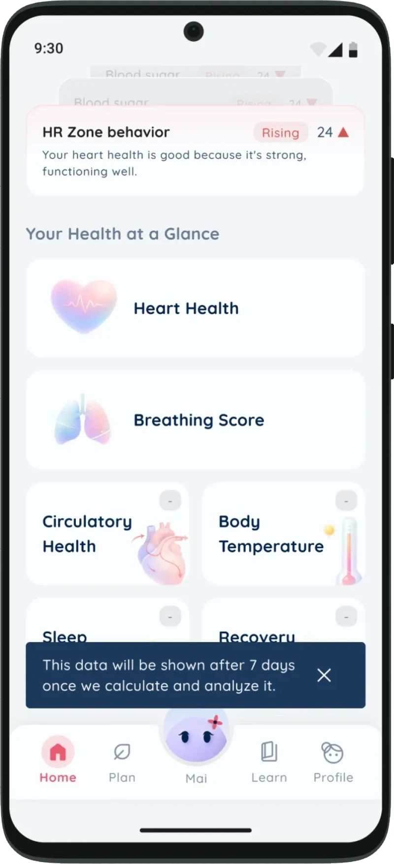
The women we were designing for were not necessarily familiar with health terms such as heart rate or SpO2. The interface needed to make the information understandable.
Design response
Home grouped information into Body, Energy, and Mind. Short labels such as “good” or “needs care” formed the first layer, with more detail available a tap away. The Health screen provided a summary of measurements such as heart rate, breathing, and sleep.
This structure let users begin with a simple summary before exploring terms or measurements they might not know, such as heart rate or SpO2.
What users told us
The band helped users stay aware of their daily health.
Mai companion
Make personal questions easier to express
Problem context
Discussing women’s health concerns could feel sensitive.
Design response
The companion used warm, familiar language to create an approachable space for those conversations.
The aim was to let users ask questions without judgement or difficult terminology. That need shaped the tone of the conversational experience.
Learn
Bring useful activities into a familiar format
The feed included yoga, breathing, recipes, and content informed by Vedic traditions.
Its browsing format drew on familiar experiences such as Instagram and YouTube. The intention was to make learning approachable and easy to explore within the app.
What users told us
Yoga and wellness activities fit into users’ routines.
Overall feedback and next steps
Keep the daily experience manageable
After the app reached users, feedback also described the interface as easy to use and navigate.
Beyond the onboarding changes, I would review screens against the question: does this help a woman take one manageable step today? The aim would be to reduce what users need to process before acting.
I would also look beyond app opens and completed tasks to understand changes in routines, including meals, sleep, and how in control users feel of their health.
What I learned
Research can change the problem you are solving
We began by focusing on access to information. The research brought daily responsibilities and habits into the centre of the design.
That shift shaped the small tasks, simple summaries, and tree-based progress. Each was a response to the context in which women would use the product.
Mai also showed me that making individual screens simple is not enough. The entire journey needs to feel manageable, especially before someone reaches the useful parts of the experience.